
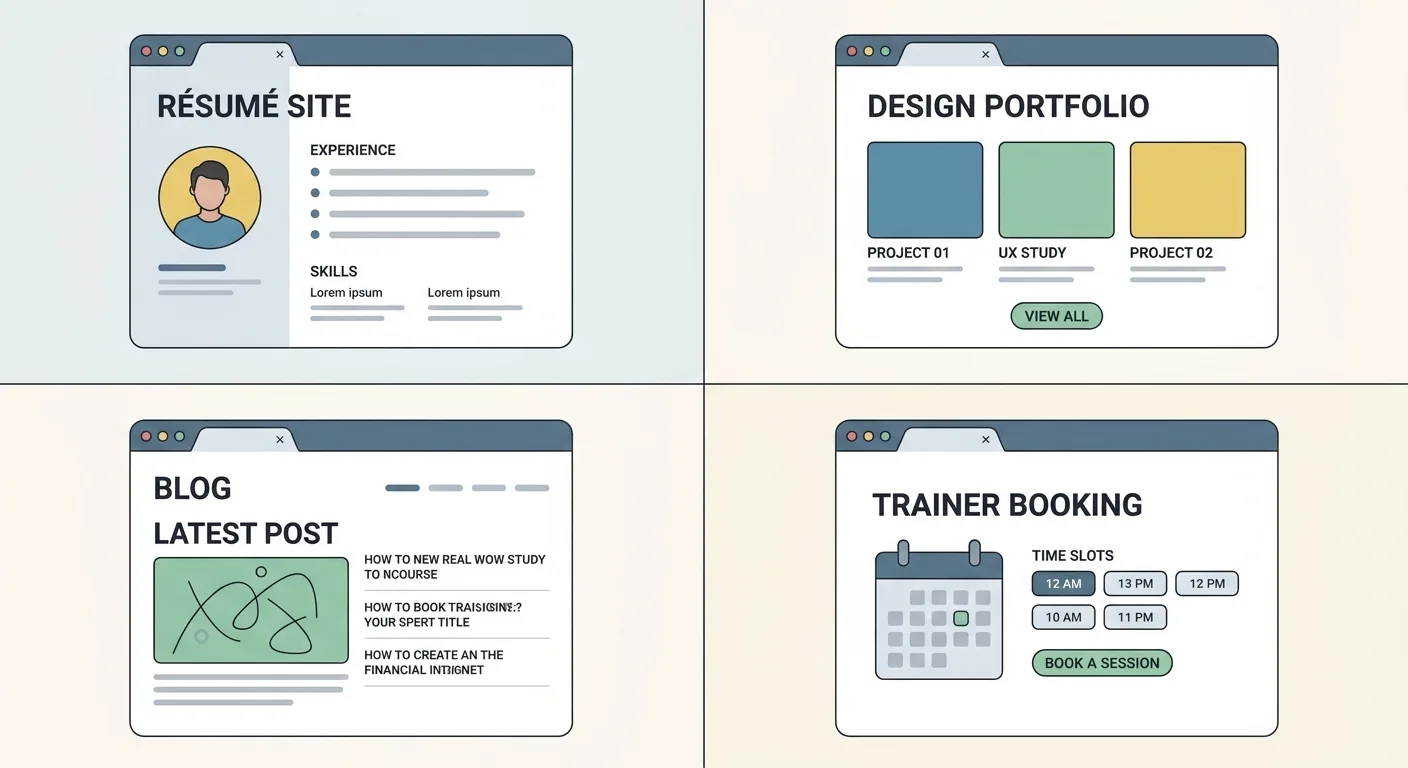
That stranger is usually one of four visitors. A hiring manager clicks your link from an application. A potential client weighs you against two other names on a shortlist. A reader lands on one post from a share. A search engine or AI assistant scans your pages to decide whether you’re worth quoting.
Beautiful sites rarely tell you what to build for your own situation, so we sorted these personal website examples by goal.
TL;DR
- Pick patterns that match your goal, whether that’s landing interviews, winning clients, building readership or booking paid sessions.
- Proof on the page (write-ups, outcomes, samples) beats design.
- Free templates work fine once you rewrite every line of demo copy and delete the sections you never use.
The Test Every Site on This List Had to Pass
What separates the best personal website examples from merely pretty ones? We asked one question of every pattern: what does a stranger need from this page in the first ten seconds? Ten seconds is our own editorial yardstick and carries no research behind it. It still forces honesty about what sits above the fold.
Personal website design examples still matter. Good type, spacing and layout make proof easier to read. Design only broke ties in our judging.
We left specific live sites out because they get redesigned, described repeatable patterns you can apply to any layout instead, and ranked nothing by follower count or fame.
Each row’s next step applies the one-click contact rule to that goal.
Which entries fit your goal?
| Your goal | Pattern group | Next step the page must make obvious | Start with entries |
|---|---|---|---|
| Landing interviews | Sites That Get You the Interview | Download the résumé or send a message | 1, 2, 3, 4 |
| Winning creative or technical work | Portfolios That Explain Their Own Decisions | Open a case study or start a project inquiry | 5, 6 |
| Building readership or expertise | Sites Built on What You Think | Read a related piece or subscribe | 7, 8, 9 |
| Booking sessions or calls | Sites That Book the Next Session | Book an intro call or session | 10, 11 |
| Getting live this weekend | Fast Starts When You Have a Weekend, Not a Month | Follow your most important link | 12, 13 |
Which of these five criteria would your current homepage fail?

Sites That Get You the Interview
Job seekers, start here. A recruiter clicking your link already has your name and wants to confirm fit fast by checking role match, evidence of skill and an easy résumé grab.
1. The One-Page Résumé Site With a Real Download Button
Most personal resume website examples boil down to one scrolling page that mirrors your résumé in readable web text and offers a clearly labeled PDF. Its value is simple: one URL you can drop into applications, email signatures and profiles.
Setting one up takes an afternoon:
- Put the target role in the headline.
- List three wins backed by your own real numbers.
- Name the PDF file with your full name and role (FirstName-LastName-Role.pdf, never resume_final_v7.pdf).
Keep the web version and the PDF in sync. A recruiter who spots a different job title in each will wonder which one is true. Retire every older copy too (yes, the one from two jobs ago still floating around counts).
A single page has little room to rank for searches, so most résumé sites work as destinations, not discovery tools. Treat yours as a place you send people.
2. The Software Engineer’s Project Log With Receipts
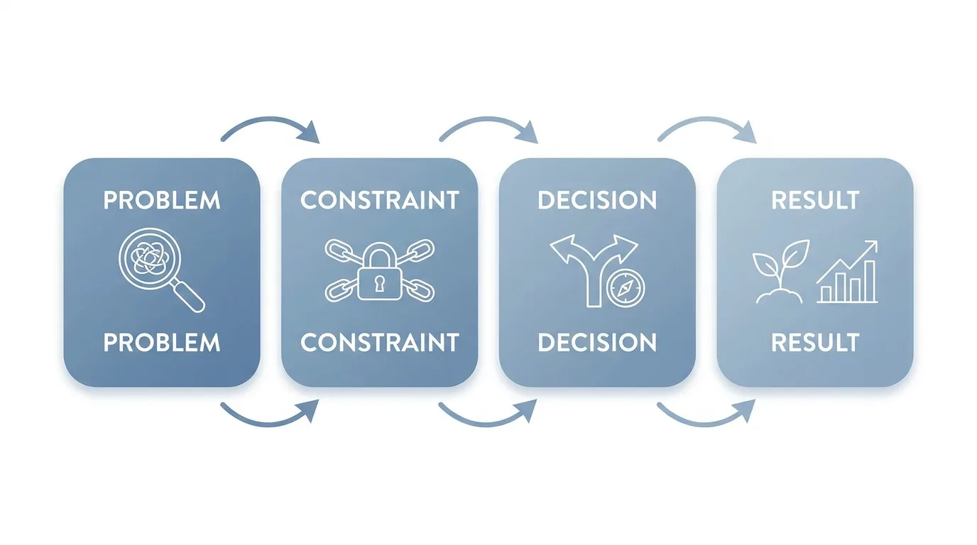
Strong CS personal website examples center on three to five deeply documented projects. Each one gets its own page covering the problem, constraints, decisions and outcome, plus links to the repo and a live demo.
The most useful engineering sites show reasoning, which a bare list of repos can’t. Reviewers want to see how you think.
Give every project its own URL and a descriptive page title. The write-up lives on your site, and the GitHub link supports it.
To-do apps and copied course projects can read as beginner work to experienced reviewers, so resist padding.
Writing Up a Project So a Hiring Manager Finishes Reading
Use four parts, two or three sentences each:
- Problem: what needed solving and for whom.
- Constraint: the time, budget, data or tech limits you worked within.
- Decision: the approach you chose and what you ruled out.
- Result: what shipped, what improved and how you know.
Close with one honest “what I’d change” line. Reviewers remember judgment, and admitting you’d restructure the database next time shows plenty of it.
3. The Student Site That Turns Coursework Into Proof
Students have the most to prove with the least history. The strongest personal website examples for students solve that by presenting capstones, class projects, research and club roles as evidence of skill. Coursework becomes concrete proof once you add context: course name, team size and your specific role.
Add a dated banner stating your availability window and target roles (“Open to summer data analyst internships”). Then give each substantial project its own page, the move that separates useful student portfolios from cluttered ones. Free hosting is perfectly fine at this stage.
Prune every semester. High school awards and outdated class pages dilute the story, and graduation is an easy time to forget.
Which single project would you want a recruiter to open first?
4. The Mid-Career Site Built Around Outcomes
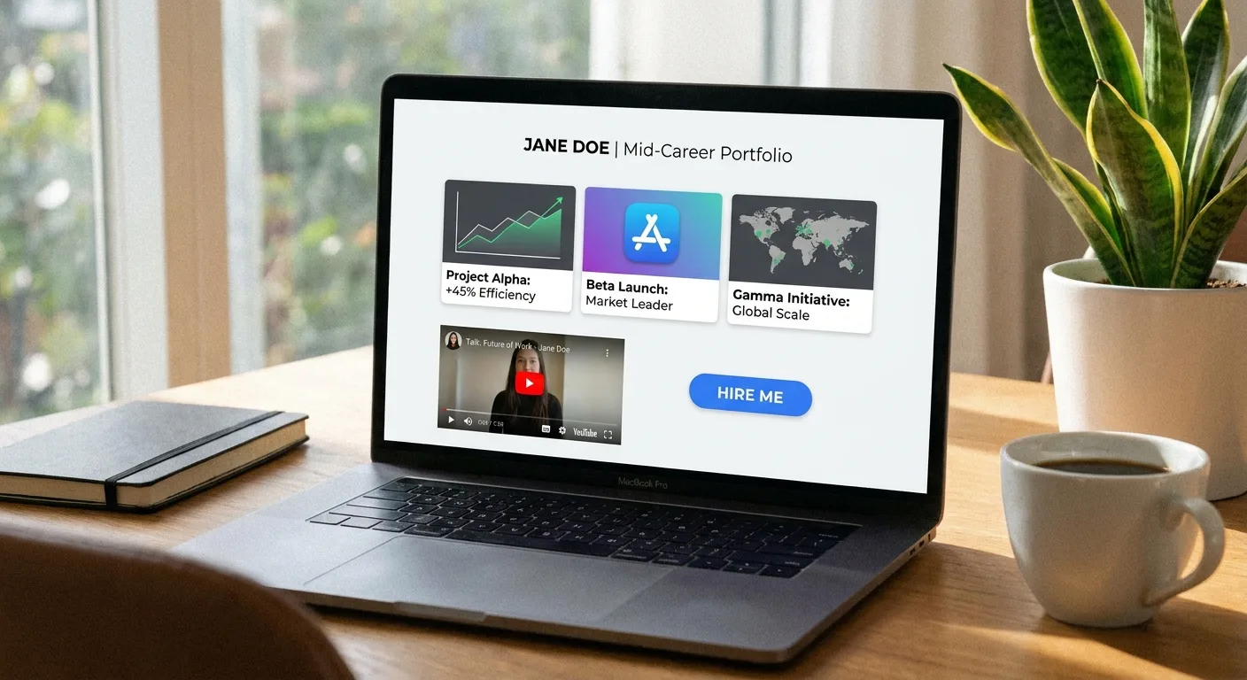
Already have a LinkedIn profile? Professional personal website examples add what a networking profile can’t hold: longer case write-ups, talks and articles. You control the framing and the depth.
Many experienced-hire sites bury outcomes under chronology. Flip that order so results lead and job history sits in the background.
- Write the About page in first person.
- Add an outcomes section with two or three write-ups.
- Make “Work with me” or “Hire me” impossible to miss.
A bio line like “Passionate, results-driven leader” says nothing a reader can verify. Use testimonials only with written permission from the person quoted.
Portfolios That Explain Their Own Decisions
Strong personal portfolio website examples show reasoning alongside visuals. Art directors, clients and tech leads scan for why the work looks the way it does, because that tells them how you’d handle their project.
5. The Designer Case Study That Starts With the Brief
Clients hire a process, and a finished image alone hides it. That’s why the graphic designer personal website examples that win clients show the brief first. Order every case study the same way: brief, constraints, explorations, final, result.
Feature four to six projects aimed at the clients you want next. That one project you love that doesn’t fit your target clients? Cut it anyway.
For NDA work, get permission or anonymize it by stripping client names and sensitive data.
The Three Captions Every Case Study Image Needs
Many portfolios skip captions, which leaves the reasoning invisible. Each caption covers three things in one line: what the image is, the decision it shows and what changed.
A sample: “Second-round homepage sketch: pricing moved above the fold after testers missed it.”
Alt text describes the image itself, and the caption explains the reasoning, so the two never duplicate each other. Captions and alt text both give crawlers real words, and an on-page SEO checker shows whether search engines are reading them.
6. The Web Developer Homepage That Doubles as a Live Demo
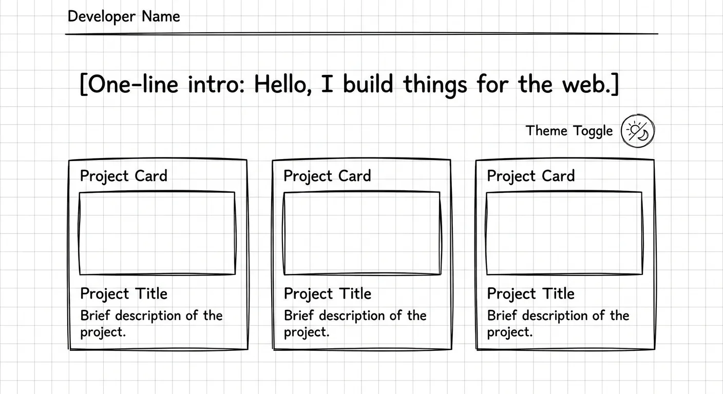
Front-end and full-stack developers hold a rare edge among personal website homepage examples: the homepage itself is evidence. Fast loading, accessible markup, a working theme toggle or one small interactive detail all prove skill through behavior. The strongest developer homepages let reviewers test the craft directly, no repo cloning required.
- Keep one tasteful interactive element with a plain-text intro beside it.
- Make every control keyboard-accessible.
- Link a short “how I built this site” note.
Restraint matters because reviewers are often comparing several candidates. Loaders, scroll-jacking and text inside canvas elements hide your words from people and crawlers alike, so run basic technical SEO checks before you ship the fancy version.
Would your homepage still make sense with JavaScript switched off?
Sites Built on What You Think
Writers, thinkers and anyone building a reputation for expertise belong here. These sites win strangers who arrive on an inner page from a search, a share or an AI answer, with zero context about you. Every page has to introduce you on its own, and the homepage often comes second.
7. The Personal Blog With a Clear Beat
Focused personal blog website examples stick to two or three defined topics, so returning readers and search engines both know what to expect. A stated beat lets each post reinforce the others.
- State the beat in your site tagline. A list of blog topics for beginners can help you pick two or three you’d write about for years.
- Group posts into topic pages so visitors always have an easy next read.
- End each post with one related read and one subscribe prompt.
A quiet blog with sharp posts still works. Posts that drift off-topic can be retired or redirected (the 2019 “hello world” post can go).
8. The Personal Brand Site Anchored by One Signature Idea
Speakers, authors and independent experts get the most from this pattern. Memorable personal branding website examples revolve around one idea or framework the owner names and repeats everywhere. That gives press, event organizers and AI assistants something specific to reference, and it hands people a phrase to use when they recommend you.
- Give the idea its own explainer page with a plain-language definition near the top.
- Build supporting posts around it. These blog topic ideas for authors offer angles that keep pointing back to the core idea.
- Add a media or speaking page with a short bio, approved headshots and talk topics.
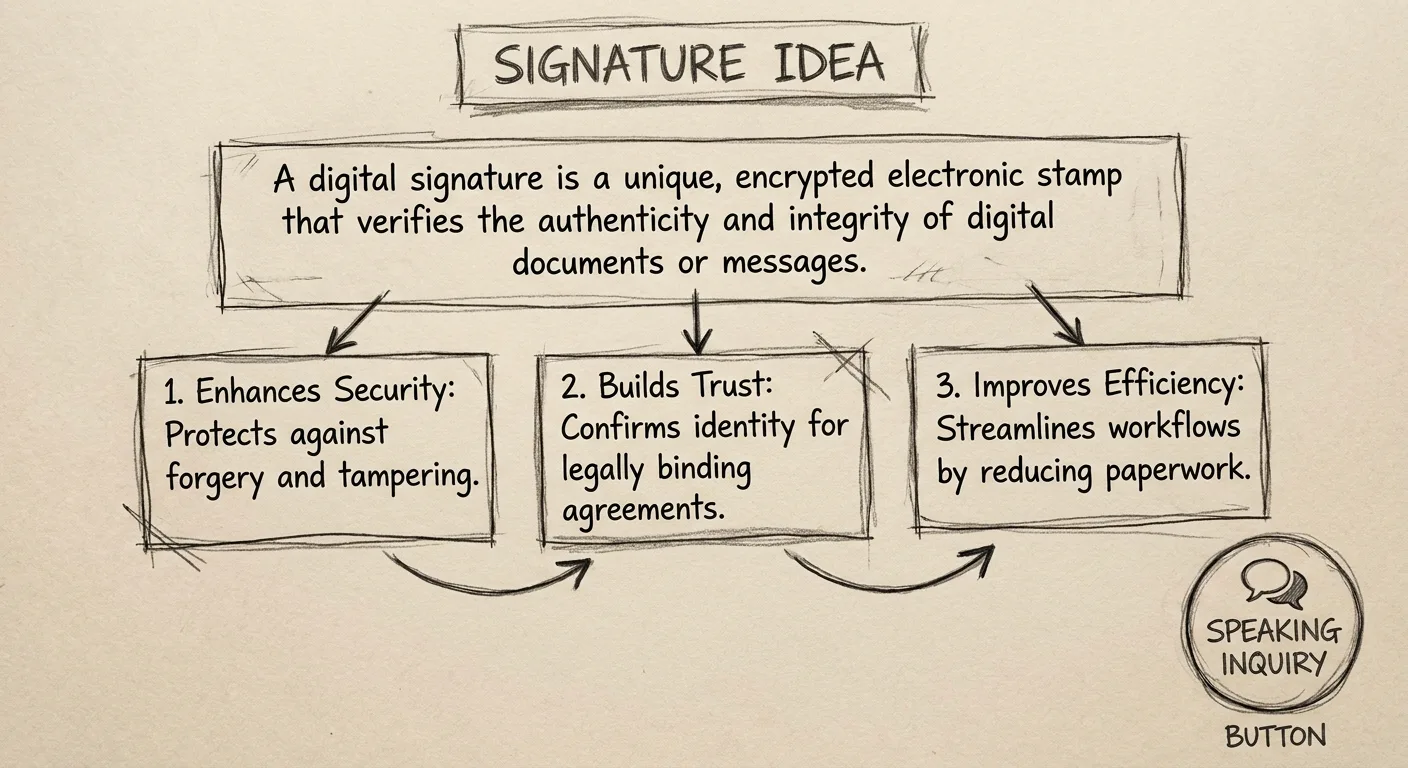
A framework can box you in as your work evolves, so keep the idea broad enough to grow with you.
9. The “Start Here” Hub for People Who’ve Made a Lot of Stuff
Podcasts, talks, threads and articles pile up fast. A single Start Here page curates the best five to ten pieces into a clear path for newcomers, and you get to choose your own first impression.
- Group picks by reader need (“New to the topic?”, “Want the deep dives?”).
- Give each pick a one-line reason to read it.
- Lead with three personal website content examples: a definitive guide, a talk recording and a project retrospective.
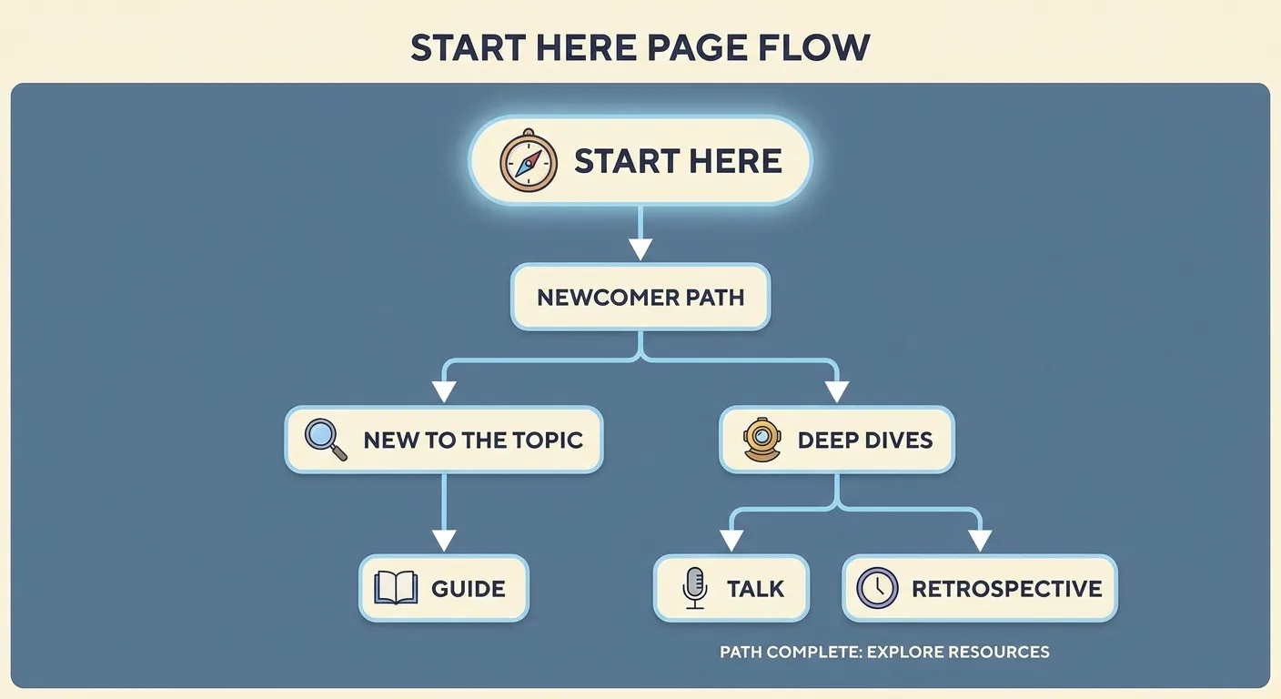
A hub that lists everything defeats its purpose. Review the picks every few months and swap in stronger work.
Which three things would you hand someone who’ll only ever read three?
Sites That Book the Next Session
Visitors here arrive with a problem and a shortlist, and any hesitation costs you the booking. Success here means booked calls. Local and online clients check specialty, price signals, logistics and trust before they commit.
10. The Personal Trainer Site That Answers Logistics Up Front
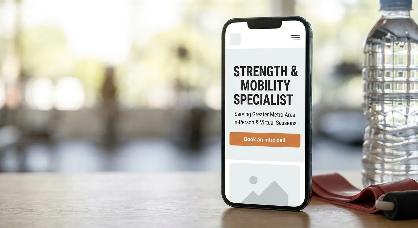
Many fitness clients browse on a phone and often want answers quickly. Effective personal trainer website examples state who they train, where, how sessions run and how to book, all near the top of the homepage. Clear logistics close sessions that motivational slogans leave open.
- Lead with specialty and audience, such as strength training for new lifters or postnatal fitness.
- Name the service area or state “online only.”
- Place a booking or intro-call button above the fold. It’s the one element we’d never cut from personal training website examples, even minimal ones.
- Add a short FAQ covering cancellations and first-session expectations.
Trainers split on pricing. A “starting from” figure filters out poor-fit leads, and some trainers prefer a consult first so they can tailor packages. Both choices are reasonable.
Get written client consent before posting before-and-after images. Any health or results promise you can’t support should come off the page.
11. The Consultant Site With One Offer and One Calendar Link
Coaches, freelancers and consultants often want to list every service they offer. Resist that urge. The personal brand website examples we find most effective at booking calls lead with a single offer, a short proof section and one scheduling link. One offer reduces decision friction for a first-time visitor.
- Name the offer, who it’s for and the result it aims at.
- Add two or three testimonials, each used with permission.
- Repeat one calendar link at the top and bottom of the page.
A single offer can feel limiting. Add a second only once steady demand shows up, and give it its own page so the first offer stays clear.
Fast Starts When You Have a Weekend, Not a Month
A quick site looks cheap only when the content is vague, so ship the clear version first and polish later.
12. The Template Site With Every Demo Line Rewritten
Tight budgets have a solid option here. Personal website templates usually handle layout and responsiveness, which frees your time for content, though you should check accessibility yourself. The same cleanup applies to personal website templates, free or paid:
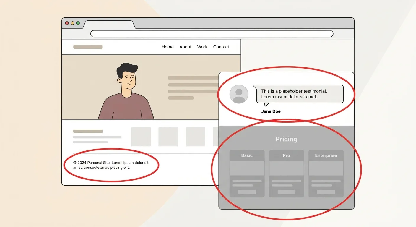
- Replace all demo text, including the footer.
- Delete unused sections and pages.
- Swap stock photos for your own.
- Set a unique page title and description for each page, ideally after choosing the right keywords for what a stranger would type.
- Connect a custom domain when budget allows.
HTML or visual builder? Neither one tends to rank higher by default.
Which template type fits you?
| Factor | Builder templates | HTML templates |
|---|---|---|
| Skill needed | No coding; edit through a visual editor | Comfort editing HTML and CSS files |
| Hosting | Runs on the builder’s own platform | Static hosting you choose and set up |
| Customization | Limited to the builder’s controls | Full control over code and layout |
| Upkeep | Platform handles software updates | You maintain files and fix issues |
Leftovers give a template away instantly. “Lorem ipsum” in a footer or a glowing demo testimonial from “Jane Doe” undermines trust fast.
13. The Minimal Link Hub With a “Now” Section
Here’s the leanest of all simple personal website examples: one screen holding a short intro, three to five key links and a dated “what I’m working on now” note. Expect roughly an hour to build it. It suits people whose work lives elsewhere.
- Write a one-sentence intro.
- Order the links by importance.
- Add a “Now” note with the month and year, refreshed every quarter.
That date keeps a tiny site feeling current. A stale one signals neglect (you’ve seen the “Now” note from three years ago), so delete the section if you won’t maintain it.
Expect little search traffic from this pattern on its own. Treat it as version one. Save sites you admire in a “my personal website examples” bookmark folder, then grow this hub into entry 1, 7 or 11 when your goals expand.
When the Site Is Live and Nobody Finds It
Publishing feels like the finish line. Then traffic sits near zero and AI assistants cite someone else. Even a clear site can stay invisible in search. Start with how rank tracking works if you’re unsure whether any page ranks at all.
This matters most for patterns 7 through 11, since those sites live on discovery. A résumé site you send straight to recruiters has little need for it.
Treating your personal site as a growth channel? As of November 2026, Vee3.ai describes itself as built for SEOs and ready for AI search: one workspace to crawl, research, plan, write, fact-check, publish and measure. You can see what Vee3.ai maps on the product page.
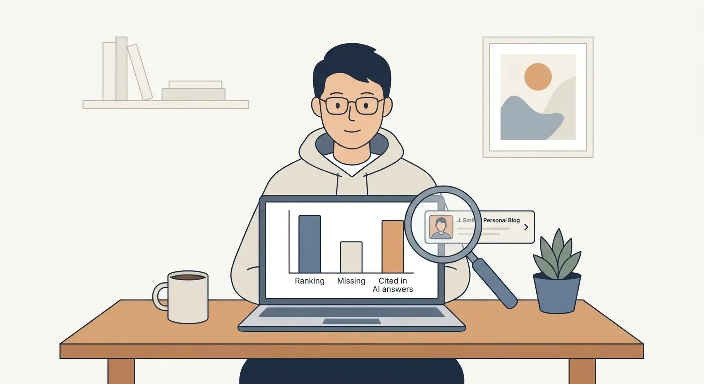
Bring your domain to Vee3.ai and run crawl-to-measure in one workspace. Start building.
Frequently Asked Questions
What should every personal website include?
Every personal website needs three basics: a headline stating who you are and who you help, at least one piece of proof, and a contact or booking path one click from the homepage. That holds for a personal website for students and a consultant’s booking page alike.
Will a free website or template make me look less professional?
No, a free template won’t look unprofessional once every line of demo copy is rewritten. Visitors judge clarity and leftover demo content, not the price tag. Add a custom domain when budget allows, since a branded URL looks deliberate on a résumé or business card. Entry 12 has the full cleanup checklist and template table.
Do I need a blog on my personal website?
You need a blog only if you want strangers to discover you through search or AI answers. Résumé and booking sites shared directly can skip it, while the idea-driven personal website examples in entries 7 to 9 depend on it. An abandoned blog signals neglect, so skip it if you won’t keep posting. Browse blog topic ideas by niche before committing to a beat.
Final Thoughts
Pick one goal for this month and choose the entry that matches it.
Then write your above-the-fold headline today, before you touch colors or fonts.
So write the headline. A stranger is about to read it.